Two therapy websites can look equally professional and perform nothing alike. One quietly books consultations every week. The other collects compliments from colleagues and silence from clients.
The difference is rarely taste. Therapist web design converts when the first screen names who you help, booking takes two clicks or fewer, trust signals sit where doubt fires, and the page loads fast on a phone. That’s the whole recipe, and almost every piece of it is testable this afternoon. The rest of this post shows you how to run the tests, plus one section most designers would rather you skip: the expensive things that don’t move bookings much at all.
What “Converts” Means in Therapist Web Design
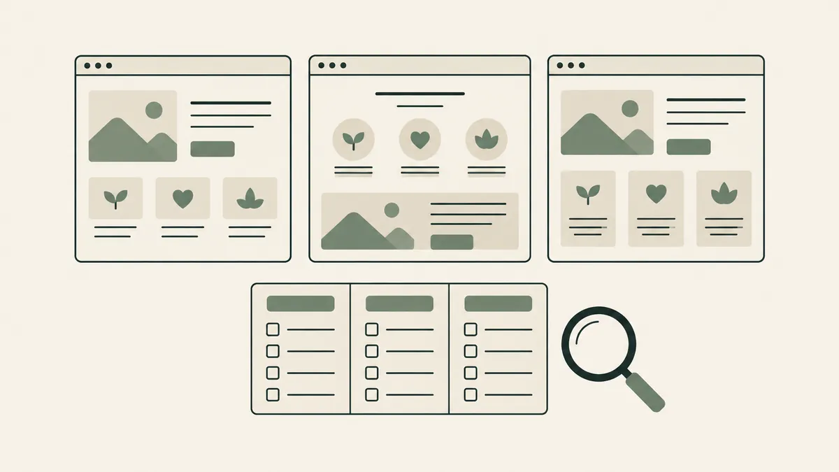
A converting therapy website turns the right visitors into consultation requests. It does this with a clear niche headline, a short booking path, trust signals placed at decision moments, and fast mobile performance. Visual polish supports those four elements; it can’t substitute for any of them.
Notice the phrase “the right visitors.” Conversion isn’t about persuading everyone. A good site actively helps mismatched visitors leave early, which protects your time and theirs.
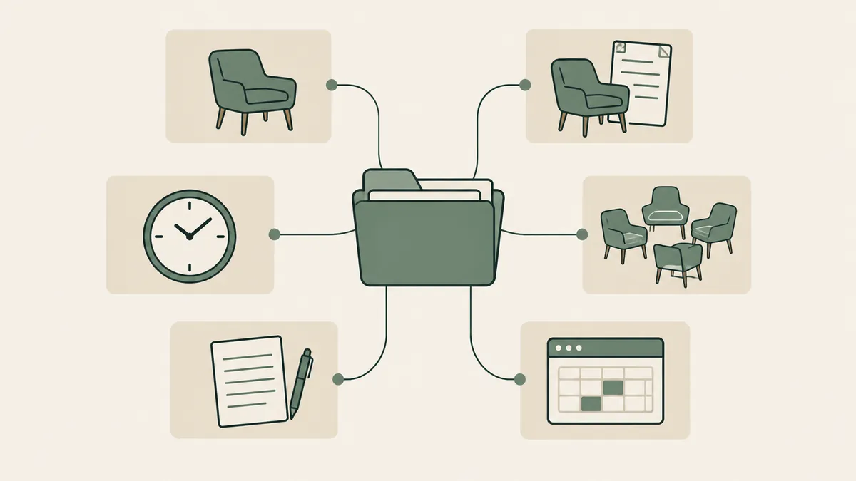
We build around a framework with three parts: behavioral UX (how anxious people actually move through pages), conversion architecture (what appears where, and in what order), and clinical user journeys (the specific route from “3 a.m. search” to “scheduled consult”). Fancy labels aside, the idea is simple. Design for the visitor’s worst week, not your best screenshot.
Here’s the opinion that shapes everything else: most underperforming therapy websites don’t have a design problem. They have a clarity problem wearing a design budget.
The Above-the-Fold Headline Test
Open your homepage. Look only at what’s visible before scrolling. Can a stranger answer three questions: who is this for, what problem does it help with, and what do I do next?
That’s the whole test. Most therapy sites fail it with grace and good typography. “Welcome to my practice” fails it. “Compassionate counseling for life’s challenges” fails it beautifully.
Compare: “Therapy for anxious professionals in Boston who can’t switch off.” A headline like that costs nothing and outperforms thousands of dollars of visual refinement, because it does the one job the first screen has — telling the right person they’re in the right place.
Write the headline before you brief a designer. If the niche isn’t clear in words, no layout will rescue it. Your brand identity work feeds this directly: positioning first, palette later.
Count the Clicks to a Booked Consultation
Sit down, open your own site, and count every click from the homepage to a submitted consultation request. Two is the target. Three is survivable. Four or more and you’re leaking people who were ready to reach out.
Each click is a small decision, and your visitor’s decision-making budget is already spent on braver questions than “where’s the contact page?” So the button goes in the header, repeats after each major section, and leads to a short form: name, contact details, preferred times. Nothing clinical, and nothing that belongs in a proper intake flow happening on unprotected plumbing.
One trap deserves its own warning, because therapists fall into it out of good instincts. Calm isn’t camouflage. Soft, low-contrast palettes feel right for this field, and they are right — until the booking button fades into the background like it’s apologizing for existing. The page can whisper. The button can’t.
Put Trust Signals Where Doubt Fires, Not Where They Fit
Somewhere between “this looks nice” and “I’m typing my phone number,” every visitor hits a wall of doubt. Is this person qualified? Will they get me? Can I afford this? Converting sites answer each doubt at the moment it appears.
- Your photo, high on the page. A real face answers the primal question first: could I sit across from this person?
- Credentials and approach near the booking button, not exiled to a CV page.
- Fees on the site. Hiding them doesn’t create calls; it creates suspicion, then a click to whoever published a number.
- An About page that talks about the client’s experience, not your conference history. It’s usually your second-most-visited page, and our therapist About page guide walks through it section by section.
Order matters as much as presence. A testimonial wall on a separate page is furniture. One line of verifiable social proof next to the booking form is architecture.
Speed and Mobile Decide More Than Any Aesthetic Choice
More than half of your visitors are on phones, and the late-night searches that lead to therapy skew even more mobile. Whatever your site looks like on your laptop is the minority experience.
Slow pages lose anxious visitors before design gets a vote. Google’s Core Web Vitals give you the measurable version: load speed, interactivity, visual stability. Oversized hero images and animation-heavy themes are the usual suspects on therapy sites, which is a quiet irony — the decoration meant to impress visitors is often what keeps them from arriving.
Accessibility belongs in the same sentence. Clear headings, readable contrast, predictable navigation, and reduced-motion options make sites usable for neurodivergent visitors and better for everyone else. Our post on autism-friendly web design covers this in depth. A site a distressed visitor can’t comfortably use does not convert, whatever it scores on style.
What Matters Less Than Designers Tell You
Now the section that annoys our own industry. Several expensive staples of “premium” web design barely move bookings for therapists:
Award-style animations. Parallax scrolling and elements that glide in on cue impress other designers. Your visitor at 2 a.m. experiences them as delay. Motion for its own sake costs speed, and speed converts.
Bespoke illustrations. Here’s our admitted trade-off, because this one isn’t black and white: custom illustration genuinely helps brand memorability, and in a crowded metro market it can be worth real money. But it’s a later purchase. Illustration on top of a vague headline is a beautiful coat on a site with no spine, and we’d rather you spend that budget on positioning and copy first.
Homepage sliders, autoplay video, decorative widgets. Movement pulls attention away from the one action the page exists for.
This priority order is the entire reason Website in a Week can exist. Spend the effort on headline, path, trust, and speed — the parts that convert — and a custom therapist site doesn’t need three months of ornament.
FAQ: Therapist Web Design That Converts
How do I know if my therapy website is converting?
Track one number: consultation requests per month, from your form, phone, and booking tool. Pair it with visit counts from a privacy-respecting analytics tool and watch the trend after each change. If traffic rises and requests don’t, the site, not the marketing, is the leak.
What should be above the fold on a therapy website?
Four things: a headline naming who you help, a real photo, one line of credibility, and a booking button. If any of those sits below the scroll line on a phone, move it up.
Do I need a blog for my website to convert?
Not to convert existing visitors, no. Blogs earn search traffic; conversion is the homepage and service pages’ job. Fix the booking path first, then write.
Does pretty design hurt conversion?
Only when it’s in charge. Calm, professional design supports trust. Problems start when aesthetics override clarity: camouflaged buttons, poetic-but-empty headlines, animations that slow the page.
Run the three tests this week: the above-the-fold read, the click count, and a phone-speed check. They’ll tell you more about your therapist web design than any redesign pitch, ours included. And if the tests turn up problems you’d rather not fix alone, start with the Website Inquiry Form — we’ll tell you honestly which fixes matter and which are decoration.