Autism-friendly web design means building a therapy website that autistic and otherwise neurodivergent visitors can use without a fight: navigation that behaves predictably, pages that don’t overload the senses, language that says what it means, and a plain answer to “what happens in a first session?” Here’s the longer version, because the details decide whether the person browsing at 11 p.m. becomes a client or closes the tab.
This matters more for therapy sites than for almost any other kind of website. Many of the people searching for a therapist are neurodivergent themselves, or they’re a parent searching on behalf of an autistic kid. And nearly everyone who lands on your site arrives stressed. Design that works for autistic visitors works for all of them.
One note before the practical stuff. Throughout this guide we say “autistic people” rather than “people with autism,” because identity-first language is what most of the autistic community asks for. Your website copy should follow the same lead.
What Makes a Therapy Website Autism-Friendly?
An autism-friendly website is predictable, low-stimulation, and literal. Navigation stays in the same place on every page, nothing moves or plays without permission, headings mean what they say, and practical details (location, fees, session length, what to expect) are easy to find and stated plainly.
None of that requires special technology. Most of it is restraint: fewer moving parts, fewer clever flourishes, fewer words that gesture at meaning instead of stating it.
The payoff reaches past any single diagnosis. Visitors with ADHD benefit from the same clear structure. Dyslexic readers benefit from the same honest typography. An exhausted parent scanning your site during a lunch break benefits from all of it. The rest of this guide walks through the four areas where therapy websites most often get it wrong, then shows you how to check your own site for free.
Predictable Navigation Beats Clever Navigation
Autistic visitors, and plenty of others, rely on pattern. When your menu sits in the same place on every page, with the same labels in the same order, the site becomes learnable. When it doesn’t, every page is a new puzzle.
The fixes are unglamorous:
- Keep one menu, always visible, in the same position on every page. No hiding navigation behind a hamburger icon on desktop.
- Label things literally. “Fees & Insurance,” not “Investment.” “About Me,” not “My Story.”
- Underline your links. A color change alone is easy to miss.
- Make the current page obvious in the menu, so visitors always know where they are.
- One clear next step per page, phrased as an action: “Book a free 15-minute call.”
About “Investment” as a menu label: it needs to retire. It’s a euphemism, and euphemisms are exactly what literal readers distrust. If a visitor wants to know what therapy costs, a menu item that avoids the word “fees” reads as evasion.
If you’re starting from a template rather than a custom build, layout choice does half this work for you. Our guide to therapy website themes covers which layouts keep navigation calm and which ones fight you.
Cut the Sensory Load: Color, Motion, and Sound
Sensory overload is the fastest way to lose an autistic visitor, and most “calming” therapy sites are noisier than their owners think. A watercolor background, three script fonts, a fading image slider, a chat bubble that pops up after four seconds. Each one is small. Together they hum.
What to do instead:
- No autoplay. Ever. Not video, not sound, not background motion. Anything that plays should play because the visitor pressed a button.
- Skip carousels and sliders. They move on their own, they hide content, and nobody reads slide three.
- Respect reduced-motion settings. Operating systems let users request less animation; your site should honor it (your developer will know prefers-reduced-motion).
- One accent color, muted palette, generous white space. High contrast for text, gentle everything else, and nothing that flashes.
- Readable type: a plain font at 16px or larger, left-aligned, with breathing room between lines. Never justified text — the uneven word spacing makes lines hard to track.
Photography follows the same rule. One calm, honest photo of you or your office beats a wall of stock images of people laughing at salads.
Say What You Mean: Literal, Concrete Language
Therapy websites lean hard on metaphor. “Begin your path toward wholeness.” “A safe space to grow.” For a literal reader, that copy is fog: it sounds warm and says nothing.
Concrete beats poetic every time. Compare the sample copy below with whatever your homepage says now:
- “Sessions are 50 minutes. I offer a sliding scale, and I’ll confirm the fee before we book.”
- “I reply to messages within two business days.”
- “Online sessions run through a secure video link; in-person appointments are Tuesdays and Thursdays.”
The same goes for buttons. “Get Started” starts what? “Book a free 15-minute intro call” tells the visitor exactly what they’re agreeing to, which is the entire point. Ambiguity feels risky. Therapy already feels risky. Don’t stack the two.
Idioms and vague reassurance deserve the same pass. A headline like “Feeling stuck?” asks the reader to interpret; “Therapy for anxiety and burnout, in person and online” tells them they’re in the right place.
Build a “What to Expect” Page — and Put Everything on It
Here’s the highest-value page most therapy websites don’t have: a single page answering every practical question about starting therapy with you. For an autistic visitor, unknowns are often the barrier, not willingness.
What belongs on it:
- Session basics: length, cost, cancellation policy, how payment works.
- The first session: what you’ll ask, whether there’s paperwork, what they can bring.
- The space: a photo of your actual office, parking and transit directions, what the waiting area is like.
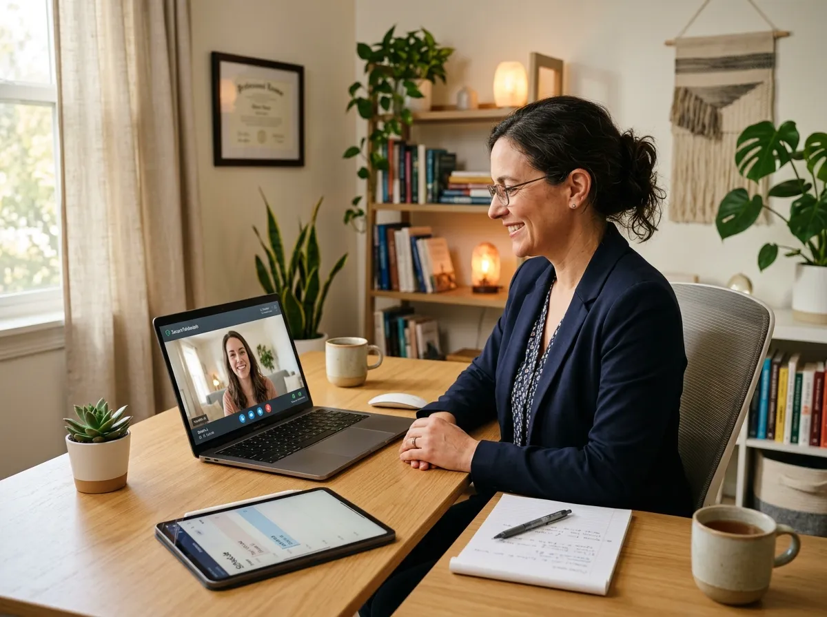
- Telehealth specifics: which platform you use, whether cameras have to stay on, what happens if the connection drops.
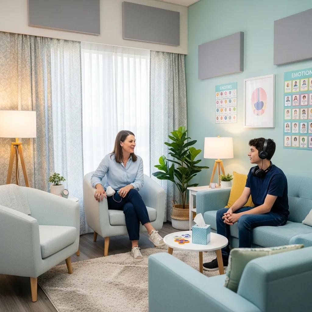
- Sensory details: lighting, noise level, whether it’s fine to stim, move around, or take a break.
- How to change things: rescheduling, running late, pausing or ending therapy.
That page earns its keep with every client, not only autistic ones. It cuts down the anxious pre-first-session emails, and it quietly signals you’ve thought about the person on the other side of the screen. When we plan a private practice website design, this page goes into the sitemap on day one.
How to Check Your Site Without a Formal Audit
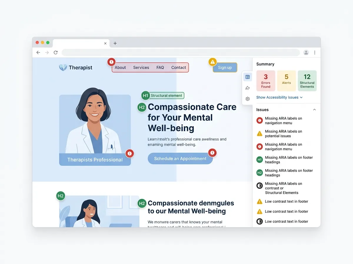
You don’t need to hire an auditor to make real progress. WCAG 2.1 (the Web Content Accessibility Guidelines) gives you the technical baseline, and two free tools catch most mechanical issues: WAVE and the axe browser extension. Run your homepage and contact page through both.
Then do the checks no tool can:
- Put the mouse aside and get from homepage to booked appointment using only the keyboard.
- Load every page and listen. Anything that moves or makes sound uninvited fails.
- Read your homepage aloud, literally. Any sentence a literal reader could misread gets rewritten.
- Hand the site to someone who’s never seen it and ask them to find your fees in under ten seconds.
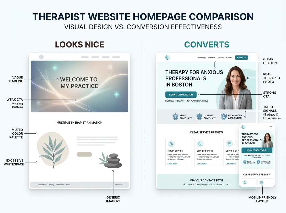
One honest trade-off: building this way costs you some visual drama. The animated hero section, the artful low-contrast palette, the cinematic scroll effects — those go. We think the trade is worth it every time. A site that wins design awards but loses anxious visitors is a portfolio piece, not a practice tool. That belief is baked into how we handle website design for therapists: WCAG 2.1-aligned design has been standard practice across the 500+ sites we’ve built for therapists and coaches. And because standards keep moving, it helps to know where web accessibility is heading — that companion piece covers the horizon; this one covers the build.
FAQ: Autism-Friendly Web Design
Is autism-friendly design the same as WCAG compliance?
Will an autism-friendly website look boring?
Should I label my website “autism-friendly”?
How much does it cost to make my site more accessible?
If you only change one thing this quarter, turn off the autoplay and write the what-to-expect page. Those two moves remove more barriers than any redesign trend will. And if the whole site needs rethinking, get a custom quote through the Website Inquiry Form — accessibility is part of the build, not an add-on.