
Therapist Personal Branding: Attract Ideal Clients Online
In an increasingly digital world, personal branding has become essential for therapists looking to stand out and attract their ideal clients. Personal branding involves creating a unique identity that reflects your values, expertise, and the services you offer. This article will explore the importance of personal branding for therapists, how to define your brand, the essential elements of a therapist website, strategies for improving online visibility, ethical considerations for social media, and how coaches and counselors can tailor their branding. By understanding and implementing effective personal branding strategies, therapists can enhance their credibility, build trust, and ultimately grow their practice.
A personal brand strategy for therapists turns that identity into specific choices: who you serve, how you sound, and what your website and profiles say first.
Why Is Personal Branding Essential for Therapists in 2026?
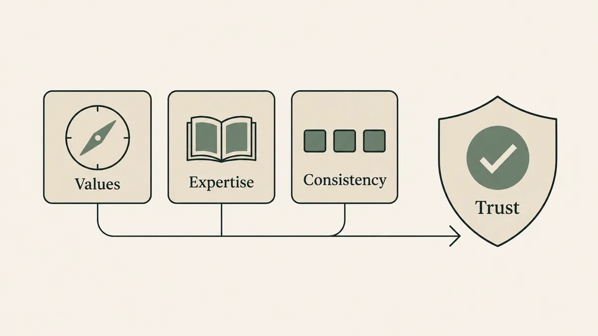
Personal branding is crucial for therapists in 2026 as it directly influences client attraction and retention. In a competitive market, a strong personal brand helps therapists differentiate themselves, making it easier for potential clients to choose them over others. A well-defined personal brand enhances credibility and trust, which are vital in the therapeutic relationship. Research indicates that clients are more likely to seek services from therapists who present a clear and authentic online identity. This article will delve into how personal branding enhances therapist credibility and the role of online presence in client attraction.
How Does Personal Branding Enhance Therapist Credibility and Trust?
Personal branding enhances therapist credibility by establishing a professional image that resonates with potential clients. When therapists present a consistent and authentic brand, they communicate their values and expertise, fostering trust. For instance, therapists who share their qualifications, experiences, and therapeutic approaches through their branding can create a sense of reliability. Case studies of successful therapist brands show that those who actively engage with their audience and showcase their unique perspectives are often perceived as more trustworthy.
What Role Does Online Presence Play in Client Attraction?
An effective online presence is vital for client attraction, as most individuals search for therapists online before making a decision. Statistics reveal that over 80% of clients research therapists through their websites and social media profiles. A professional website that reflects a therapist’s brand can significantly impact client inquiries. Additionally, engaging content on social media platforms can enhance visibility and attract potential clients. Therefore, therapists must prioritize their online presence to ensure they are discoverable and appealing to their target audience.
Therapist Personal Branding: Attract Ideal Clients Online

Defining a therapist’s brand involves identifying their niche, crafting effective messaging, and establishing a unique value proposition (UVP). A clear brand helps therapists communicate their expertise and attract clients who resonate with their approach. This section will explore how to identify and define a therapy niche and the importance of a unique value proposition in differentiating a practice.
How Do You Identify and Define Your Therapy Niche?
Identifying a therapy niche involves understanding the specific population or issues a therapist wants to address. Therapists can start by reflecting on their training, interests, and the types of clients they feel most passionate about helping. Steps to identify a niche include conducting market research, analyzing client demographics, and assessing personal strengths. For example, a therapist specializing in trauma may focus on working with survivors of abuse, while another may concentrate on anxiety management for young adults.
What Is a Unique Value Proposition and How Does It Differentiate Your Practice?
A unique value proposition (UVP) articulates what sets a therapist apart from others in the field. It answers the question, “Why should clients choose you?” A well-crafted UVP highlights the therapist’s unique skills, experiences, and the specific benefits clients can expect. For instance, a therapist who integrates mindfulness techniques into their practice may emphasize this approach in their UVP, attracting clients interested in holistic healing. Effective UVPs are clear, concise, and resonate with the target audience, making them a powerful tool for differentiation.
Brand Strategy and Web Design for Therapists: Essential Website Elements
A therapist’s website serves as a digital storefront and is crucial for effective personal branding. Essential elements of a therapist website include responsive design, user-friendly navigation, and visual identity components that reflect the therapist’s brand. This section will discuss how these elements support branding and enhance client engagement.
How Does Responsive and User-Friendly Design Support Your Brand?
Responsive and user-friendly design is vital for ensuring that potential clients have a positive experience when visiting a therapist’s website. A well-designed website adapts to various devices, making it accessible to users on smartphones, tablets, and desktops. This accessibility enhances user experience, encouraging visitors to explore the site further. For example, a therapist’s website that loads quickly and is easy to navigate can lead to higher engagement rates and increased client inquiries.
Why Are Visual Identity Elements Like Colors and Fonts Critical for Branding?
Visual identity elements, such as colors and fonts, play a significant role in branding by conveying emotions and establishing a therapist’s professional image. Colors can evoke specific feelings; for instance, blue often represents calmness and trust, making it a popular choice for therapy websites. Fonts also contribute to the overall aesthetic and readability of the site. Consistent use of visual elements across all platforms reinforces brand recognition and helps create a cohesive online presence.
This table illustrates how essential website elements contribute to effective personal branding for therapists, ultimately enhancing client engagement and trust.
A Therapist Brand Visibility Strategy: SEO and Content Marketing
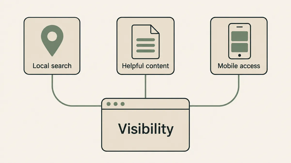
Improving online visibility is crucial for therapists looking to attract clients. Search engine optimization (SEO) and content marketing are two effective strategies that can enhance a therapist’s online presence. This section will explore the most effective SEO strategies for therapist websites and how content marketing can establish thought leadership.
These strategies are fundamental to any therapist’s patient acquisition efforts, as highlighted by research into effective marketing for practitioners.
Therapist Marketing: Patient Acquisition Strategies
This article outlines a patient acquisition strategy which any physical or manual therapist can adopt to generate new leads and nurture these and existing leads through the sales funnel,
A MARKETING STRATEGY FOR THERAPISTS., 2017
What SEO Strategies Are Most Effective for Therapist Websites?
Effective SEO strategies for therapist websites include optimizing for local search, using relevant keywords, and ensuring mobile-friendliness. Local SEO is particularly important, as many clients search for therapists in their area. Therapists should claim their Google Business Profile listing, encourage client reviews, and use location-based keywords throughout their website content. Additionally, incorporating target keywords related to therapy services can improve search rankings and visibility.
How Does Content Marketing Establish Thought Leadership and Attract Clients?
Content marketing allows therapists to share valuable insights and establish themselves as thought leaders in their field. By creating informative blog posts, videos, or podcasts, therapists can engage their audience and provide helpful resources. This not only builds trust but also improves SEO by driving traffic to their website. For example, a therapist who regularly publishes articles on mental health topics can attract potential clients seeking guidance and support.
What Ethical and Practical Considerations Should Therapists Know About Social Media and Online Branding?
While social media can be a powerful tool for branding, therapists must navigate ethical considerations to maintain professionalism. This section will discuss how therapists can maintain ethical standards on social media and suggest content ideas that help build a professional online identity.
Maintaining a professional and ethical online presence is paramount, especially given the public trust placed in psychological professionals.
Ethical Personal Branding for Psychologists
A psychologist with a personal brand benefits from the credibility afforded to them through the public’s trust in professional psychology, and this trust also requires respect for the ethical
Personal branding for psychologists: Ethically navigating an emerging vocational trend., 2017
How Can Therapists Maintain Ethical Standards on Social Media?
Therapists should adhere to ethical guidelines when using social media to protect client confidentiality and maintain professional boundaries. This includes avoiding sharing identifiable client information and being cautious about personal opinions that may affect their professional image. Therapists can also use social media to share educational content, promote mental health awareness, and engage with their audience while remaining within ethical boundaries.
Current research further emphasizes the ongoing need for clear ethical guidelines and training to navigate the complexities of social media use in therapy.
Social Media Ethics for Therapists
in therapist use of social media, current ethical guidelines of ethical dilemmas experienced by therapists on social media, be incorporated into therapist training and ethical guidelines to
Current ethical dilemmas experienced by therapists who use social media: A systematic review, T Hanley, 2024
What Content Ideas Help Build a Professional and Engaging Online Identity?
Building a professional online identity involves sharing content that resonates with the target audience. Therapists can create posts that offer mental health tips, share success stories (with client consent), or discuss relevant topics in therapy. Engaging content can include infographics, videos, or live Q&A sessions that encourage interaction. By providing valuable resources, therapists can establish themselves as approachable and knowledgeable professionals.
How Do Coaches and Counselors Tailor Personal Branding to Stand Out Online?
Coaches and counselors face unique branding needs compared to traditional therapists. This section will explore the distinct branding requirements for coaches and how counselors can develop an effective online presence.
What Are the Unique Branding Needs of Coaches Compared to Therapists?
Coaches often focus on goal-setting and personal development, which requires a branding approach that emphasizes motivation and empowerment. Unlike therapists, who may address mental health issues, coaches may highlight their methodologies and success stories to attract clients. This distinction necessitates a branding strategy that showcases their unique coaching style and the results clients can expect.
How Can Counselors Develop an Effective Online Presence?
Counselors can develop an effective online presence by creating a website that reflects their therapeutic approach and values. This includes sharing client testimonials, offering resources, and engaging with the community through social media. By presenting a clear and authentic online identity, counselors can attract clients who resonate with their approach and build a supportive online community.
This table compares the branding needs of coaches and counselors, illustrating how each can tailor their approach to effectively engage their target audience.