Search “best website design for therapists” and you’ll mostly get galleries. Forty screenshots, soft color palettes, zero explanation of why any of it works.
This post does the opposite. The best website design for therapists comes down to three habits: it names who you help within seconds, it makes booking a two-click job, and it places trust signals exactly where a nervous visitor starts to doubt. We’ve built 500+ websites for therapists and coaches, so instead of another screenshot parade, here’s a teardown of real design decisions from sites we’ve shipped — and how to judge your own site against the same standard.
What Makes a Therapist Website “the Best”?
The best website design for therapists pairs a clear niche statement with a short booking path and well-placed trust signals. Within about five seconds, a visitor should know who the therapist helps, feel calm on the page, and see one obvious next step, usually a consultation request or an appointment button.
Notice what’s missing from that definition. Awards. Animations. Originality for its own sake.
Here’s our first strong opinion: “best” is a behavior question, not a beauty question. Your website is the best one in your market if the right person lands on it at 11 p.m., feels understood, and reaches out. Everything else is decoration on top of that one transaction of trust.
The useful part is that this standard is testable. Each section below covers one design decision that moves it, with a real example of how we’ve applied it.
Niche Clarity: Say Who You Help Before Anyone Scrolls
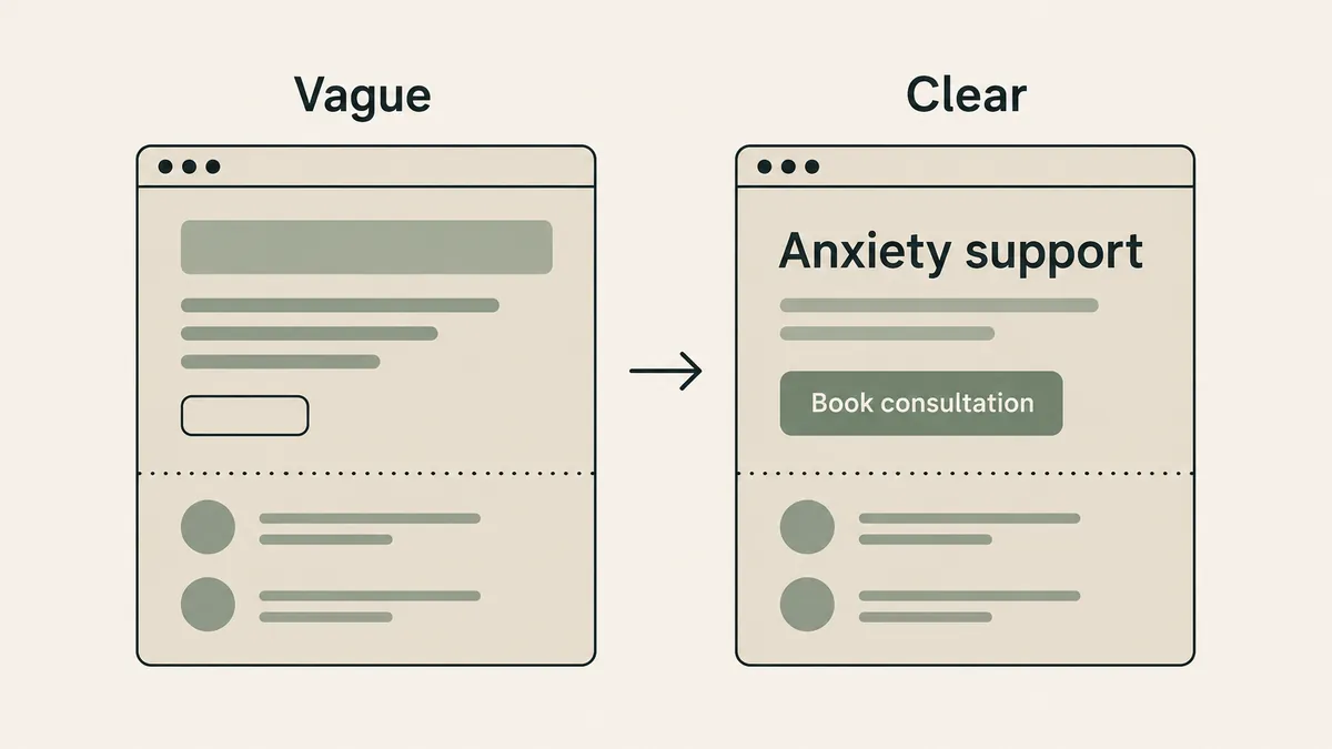
The homepage we built for Steady Mind opens by naming exactly what the practice treats: anxiety, worry, and overthinking. A “Request Appointment” button sits in the same view. Nobody scrolls to find out whether they’re in the right place. The first screen does the sorting.
Those three words are doing more work than anything else on the page, because they’re the words a struggling person actually uses about themselves. Almost no one searches “treatment for generalized anxiety disorder” at midnight. Plenty of people search some version of “I can’t stop overthinking.”
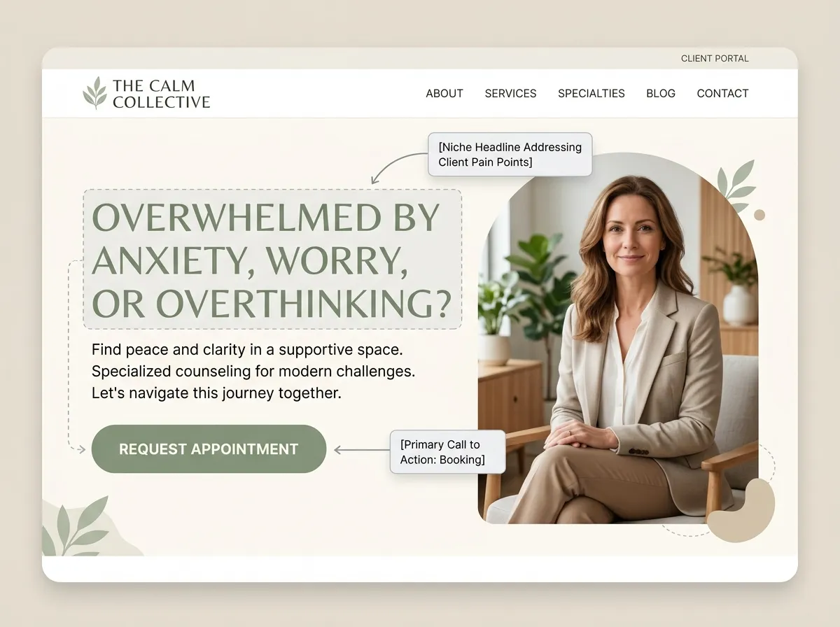
Now compare the headline on most therapy websites: “A safe space to heal and grow.” Sincere, warm, and interchangeable with every practice in your state. A visitor reading it learns nothing about whether you’re for them.
The decision to steal: your first headline should name the problem you treat, in your client’s language, with the booking action visible on the same screen. If your niche fits in the headline, the rest of the site only has to avoid fumbling the handoff.
The Booking Path: Two Clicks From Anywhere
For a solo practice, the booking path is simple to fix: put a booking or contact button in the header, repeat it after every major section, and keep the form short. Name, contact details, preferred times. That’s it. An eleven-field intake form on a first-touch page is a design decision too — a bad one.
Group practices have the harder version of this problem. When we design for a multi-clinician practice like KMA Therapy, the visitor’s question shifts from “is this therapist for me?” to “which of these people should I talk to?” The design answer is navigation organized by concern, not by staff directory. A visitor worried about their marriage shouldn’t have to read twelve bios to find the couples therapist.
Either way, the test is identical. Count the clicks from any page to a submitted booking request. Two is the ceiling. Every extra click is a place for an anxious visitor to lose their nerve, and buried contact paths sit near the top of the therapy website mistakes we see in audits.
Calm Without Camouflage
Therapists ask us for “calm” more than any other word, and they’re right to. A person browsing therapy sites is often having a rough week; visual noise reads as one more demand on them.
But there’s a failure mode nobody warns you about: calm slides into camouflage. The palette gets so soft and so uniform that the booking button dissolves into the background, the headline whispers, and the site becomes a beautiful place where nothing happens.
The builds we did for Zen Mind and Coral Heart Counseling live on the calm end of the spectrum — gentle palettes, generous white space, unhurried layouts. The discipline in both was keeping contrast where action happens. The page can be quiet as long as the button isn’t.
This balance sits at the center of how we approach website design for therapists: behavioral UX first, aesthetics in service of it, never the other way around. Calm is a design value. Invisible is a design failure.
Trust Signals Where Doubt Happens, Not Where They’re Convenient
Choosing a therapist is a high-stakes, low-information decision. Great design anticipates the exact moments doubt shows up and answers it right there, instead of stockpiling credibility on a page nobody visits.
On Dr. Guitelman Psychological Services, the doctoral credential belongs up front, because “is this person actually qualified?” is the first silent question a visitor asks. For a practice like Brave Soul Therapy, warmth carries more of the load — and it helps that the trust is verifiable: Felicia Hermle has said the site revamp exceeded her expectations, which you can read alongside other warm remarks from our clients.
Three placements matter most:
- A real photo of you near the top. Stock photography answers “can I sit in a room with this person?” with a shrug.
- Credentials and fees near the booking action, where the “can I trust this, can I afford this” questions actually fire.
- An About page written for clients, not colleagues. It’s usually the second-most-visited page on a therapy site, and we’ve written a full guide to building an About page clients trust.
And one quieter trust signal: what your contact form does with sensitive information. A minimal form routed through BAA-compliant tools protects visitors before they’re clients. That’s HIPAA-aware design, and it’s invisible when done right.
The Same Rules Travel Across Niches and Borders
Skeptical that a handful of principles covers every kind of practice? Fair. Our portfolio disagrees, though.
Bowen Therapy SG serves clients in Singapore seeking hands-on bodywork. Pioneer Counseling Center is a counseling practice with an entirely different client base and tone. Different markets, different modalities, different visual worlds. The architecture underneath is the same: a first screen that names who it’s for, a short path to booking, trust signals placed where doubt fires.
Two more things travel everywhere, and they’re unglamorous:
Mobile is the primary design, not the adaptation. More than half of web traffic comes from phones, and late-night therapy searches skew even more mobile. The best therapist websites are designed thumb-first.
Accessibility is part of “best,” full stop. We build to WCAG 2.1 so that neurodivergent visitors, screen-reader users, and anyone with low vision can actually use the site. A therapy website that excludes people with disabilities has failed at the brief in a way no award can offset.
Frequently Asked Questions
What should a therapist website include?
How much does the best website design for therapists cost?
Is a template ever the best choice?
How long does a good therapist website take to build?
Where to Go From Here
Judge your own site in five minutes: open it on your phone, read only the first screen, and ask three questions. Would a stranger know who I help? Could they book in two clicks? Is there a reason to trust me visible right now? If any answer is no, you’ve found your next project. And if you’d rather hand it to a team that builds these every week, start with the Website Inquiry Form and we’ll give you an honest read on what your site needs.