Somewhere in your city, someone is searching for a therapist right now. It’s 11 p.m., they’re anxious, and they have nine tabs open. If your website makes them squint, scroll, or hunt for a way to reach you, they close the tab and book with whoever made it easy.
We’ve built 500+ websites for therapists and coaches, and the same six mistakes show up in almost every audit we run:
- Navigation that hides the essentials — fees, specialties, and the contact button buried three clicks deep.
- Copy written for colleagues, in clinical language your clients never type into Google.
- A desktop-only design that breaks on the phone screens most visitors actually use.
- A generic look any practice in your state could claim.
- Contact forms quietly collecting health information without the right safeguards.
- No search presence, so the whole thing sits unread.
Let’s take them one at a time, worst offenders first.
Mistake 1: Navigation That Makes Visitors Work for It
A person having a hard week doesn’t browse. They scan. Nielsen Norman Group’s usability research has shown for decades that visitors decide within seconds whether a site is worth their effort, and a confusing menu is one of the fastest ways to lose them.
Your menu needs five items. Maybe six. Home, About, Services, Fees, Contact. Every extra dropdown is a place for an anxious visitor to get lost.
And put your fees on the site. Yes, publicly. Therapists push back on this constantly, and we hold the line every time: hiding your fee doesn’t make anyone more likely to call. It makes them wonder what you’re hiding, then email the practice that told them the number.
Two clicks. That’s the maximum distance between any page on your site and “book a consultation.” Count yours today.
Mistake 2: Writing for Your Colleagues Instead of Your Clients
“Evidence-based psychodynamic treatment for affect dysregulation” is a perfectly accurate sentence. Nobody in distress has ever typed it into a search bar.
Your future client searches “why do I snap at everyone I love” or “anxiety therapist near me.” Your website should answer in the same plain language. Save the modality names for a shorter section further down the page, where a detail-oriented visitor can find them after the human part of your copy has done its work.
Nowhere does this matter more than your About page. It’s usually the second page a visitor opens and often the one that decides things. We wrote a full guide to writing a therapist About page clients actually trust, and the short version is: lead with who you help, not where you trained.
Mistake 3: Treating Mobile as an Afterthought
More than half of all web traffic has come from phones since 2017, and late-night therapy searches skew even more mobile than that. Yet every month we audit therapist sites that were clearly built, reviewed, and approved on a 27-inch monitor and never once opened on a phone.
Try it now. Open your site on your phone.
Does the text wrap strangely? Do you have to pinch-zoom to read your fees? Is the contact button under your thumb, or three scrolls away? A site that fails this test fails the majority of the people who visit it, no matter how good it looks on your desk.
Mistake 4: Looking Like Every Other Practice in Town
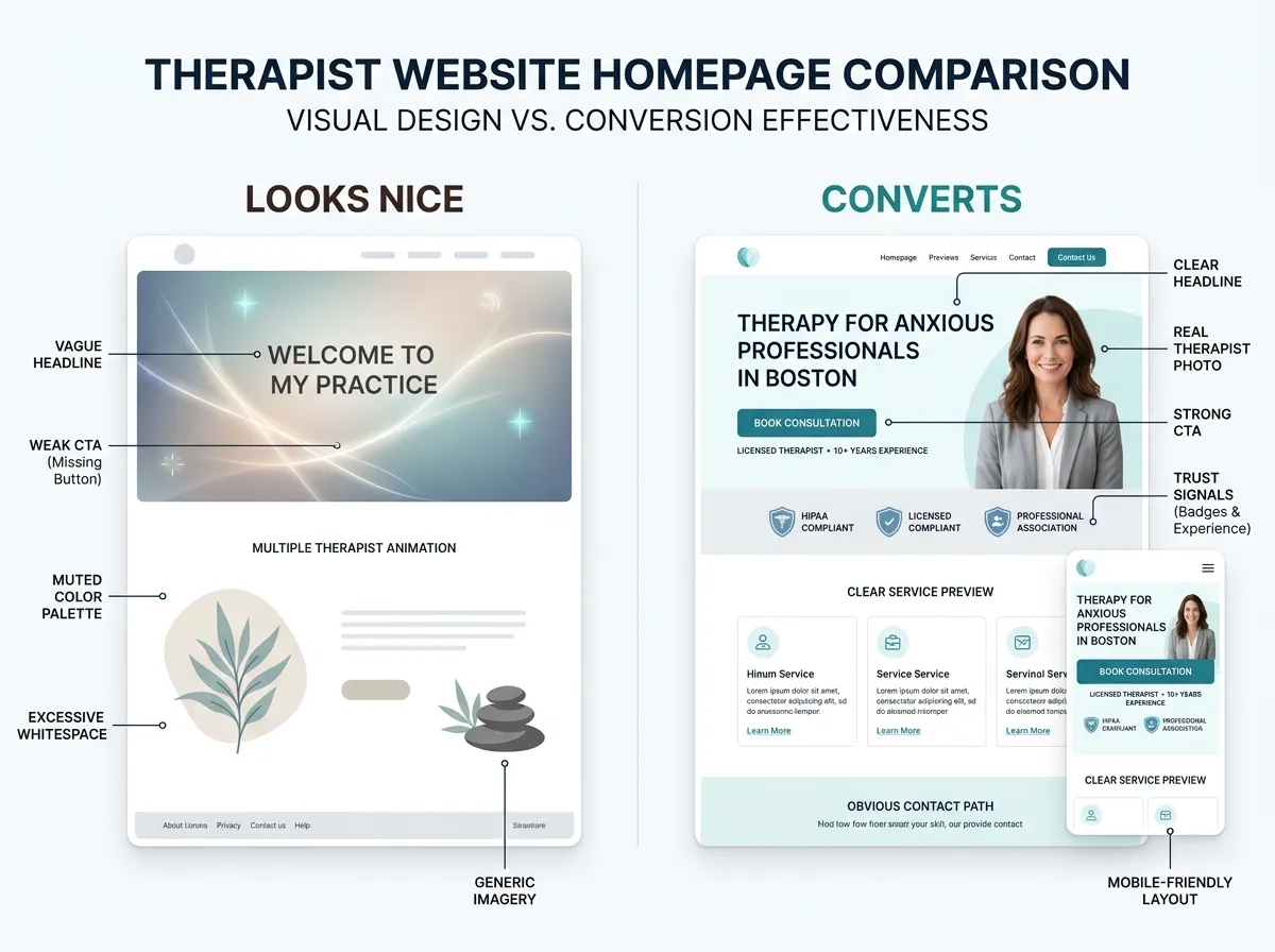
You know the site. Soft blue palette, stock photo of a sunlit path through trees, headline promising “A Safe Space to Heal and Grow.” It isn’t bad. It’s interchangeable, and interchangeable doesn’t get chosen.
Your homepage headline should say something no neighboring practice could honestly copy: who you help, with what. “EMDR for first responders in Philadelphia” beats “compassionate counseling for life’s challenges” every single time. That one sentence is your differentiation; the design’s job is to make it believable.
Here’s the honest trade-off on how you get there. A custom build typically runs $3,000–$15,000 and gives you a site nobody else has. A quality template costs far less (DIY platforms run $12–$40 a month) but shares its bones with other practices, so you’ll need strong photos and sharp copy to stand apart. Our buyer’s guide to therapy website templates covers how to choose one well. And if you want custom quality without the agency timeline or invoice, our Website in a Week service delivers a fully custom site in 7 days.
Mistake 5: Collecting Health Details Through a Standard Contact Form
This one is quieter than the others. It’s also the most serious.
A friendly “What brings you to therapy?” box on an ordinary contact form sends whatever your visitor types through form plugins and email servers that were never set up to handle health information. No business associate agreement. No safeguards. No record of where that message rests.
The fix isn’t panic, and it isn’t buying an expensive compliance badge either. A therapy website shouldn’t store protected health information at all. Keep your form minimal (name, contact details, preferred appointment times) and route anything clinical through BAA-covered tools. That’s what HIPAA-aware design means in practice. Our guide to the real HIPAA rules for therapist websites walks through exactly where the line sits, and the primary source lives at HHS.gov if you want it straight.
Mistake 6: Assuming a Nice Website Will Get Found on Its Own
Publish and pray is not a strategy. A beautiful site with no search presence is a brochure locked in a drawer.
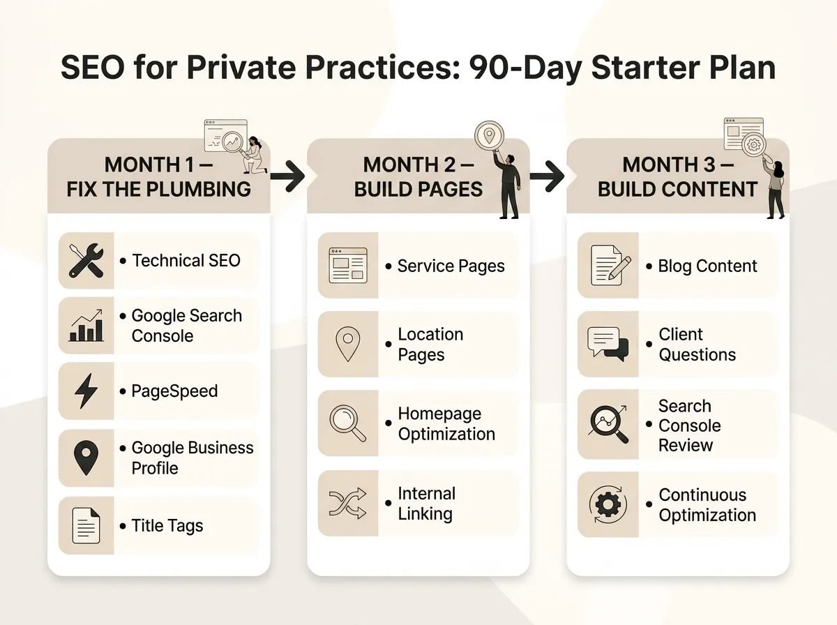
The basics carry most of the weight:
- One page per specialty, not one paragraph per specialty on a single crowded page.
- Your city and state in page titles, because “therapist” alone puts you up against the entire internet.
- A claimed, completed Google Business Profile, even if your practice is mostly telehealth.
- Page titles that match what people actually search, not what sounds elegant.
You don’t need to blog weekly or learn keyword software. You need the fundamentals done once, properly, then reviewed a couple of times a year.
FAQ: Therapy Website Mistakes
What should a therapy website include?
Do I need a whole new website, or can I fix my current one?
How long does a therapist website take to build?
How much does it cost to fix these mistakes?
None of these mistakes means starting over. Pick the one that made you wince, fix it this month, then move to the next. And if you’d rather hand the whole list to people who fix these for a living, start with the Website Inquiry Form and we’ll give you an honest read on what your site needs — and what it doesn’t.