Most roundups of therapist website examples are galleries. Twenty pretty homepages, a line about the color palette, next. You scroll, you like a few, and you close the tab no closer to knowing what to change on your own site.
This one is short on purpose. Four real practices, all sites our studio built, and one decision from each that you can copy this week.
What are some of the best websites for therapists?
Four worth studying are Steady Mind, Brave Soul Therapy, Coral Heart Counseling, and Dr. Guitelman Psychological Services. Each is a live private practice site, and each gets one decision right: a plain first sentence, specialty pages sorted the way clients search, fees posted in the menu, or a bio that leads with licensure.
Here’s the short version before the detail.
| Site | Practice | Decision to copy | Where to look |
|---|---|---|---|
| Steady Mind | Virtual practice, Michigan | The first sentence | Homepage headline |
| Brave Soul Therapy | Online group practice, California | Specialties split three ways | Main menu |
| Coral Heart Counseling | Group practice, Chicago | Fees posted in the menu | Insurance/Fees page |
| Dr. Guitelman Psychological Services | Solo psychologist, licensed in multiple states | Bio leads with licensure | Homepage and About page |
How we chose these therapist website examples (and why we’re biased)
Every site on this page is one we built. So yes, we’re biased, and you should read the praise with that in mind.
What you get in exchange is the reasoning. A designer browsing for inspiration can tell you a homepage looks calm. We can tell you why a fees link belongs in the menu.
We’ve built 500+ websites for therapists and coaches, and this list of therapist website examples has four. We started with eight from our public portfolio and kept the ones we could check line by line on the live page the day we wrote this. Two rules shaped the rest:
- Words, structure, and paths only. Colors and photos are taste. The order of a menu is a decision you can borrow.
- No results claims. We won’t tell you any of these sites filled a caseload. A website is one part of how a practice grows, and we don’t publish client numbers.
One more thing. Practices edit their sites after launch, and a couple of these have grown well past what we first shipped. Everything below describes what’s live now.
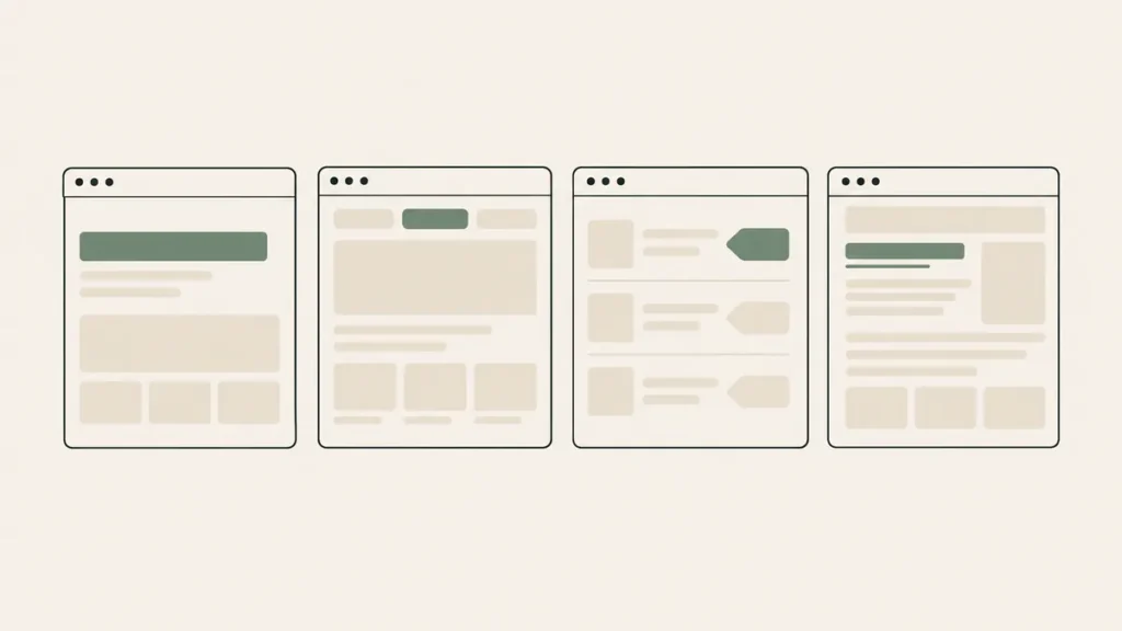
Four private practice therapist websites and the one decision to copy from each
1. Steady Mind: a first sentence that names the problem
Steady Mind is a virtual practice serving clients across Michigan. Its homepage opens with seven words: “Get your mind back on your side.”
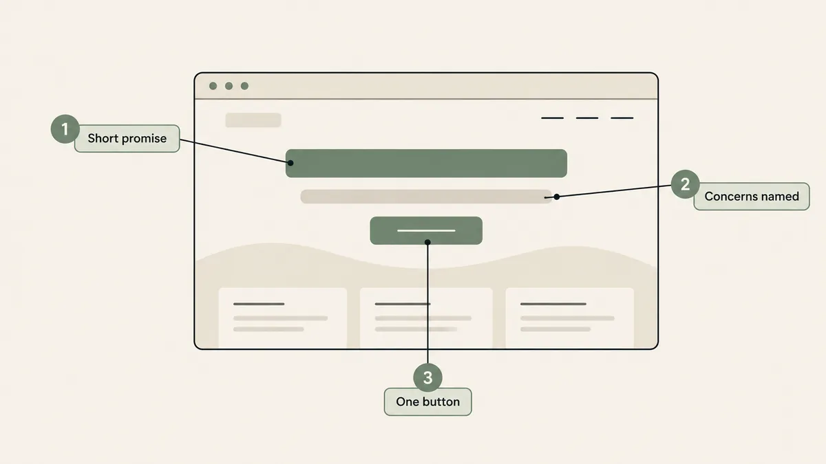
The line under it does the sorting. It names the people the practice works with: those dealing with anxiety, worry, and overthinking. Then one button, “Request Appointment.”
Say a prospective client lands there at 10 p.m. after a bad week. Within a few seconds they know what this practice is for and whether they’re in the right place. Nobody has welcomed them or thanked them for visiting.
Skip the “Welcome to my practice” headline. It tells a stranger nothing.
Copy this: write your headline as a plain promise in under ten words, then name two or three concerns in the next line. Our messaging and voice guide walks through how to find those words.
While you’re there, look at the booking buttons. There are four different labels on the homepage, and every one of them lands on the same page, which offers a free 15-minute phone consultation.
2. Brave Soul Therapy: specialties split three ways
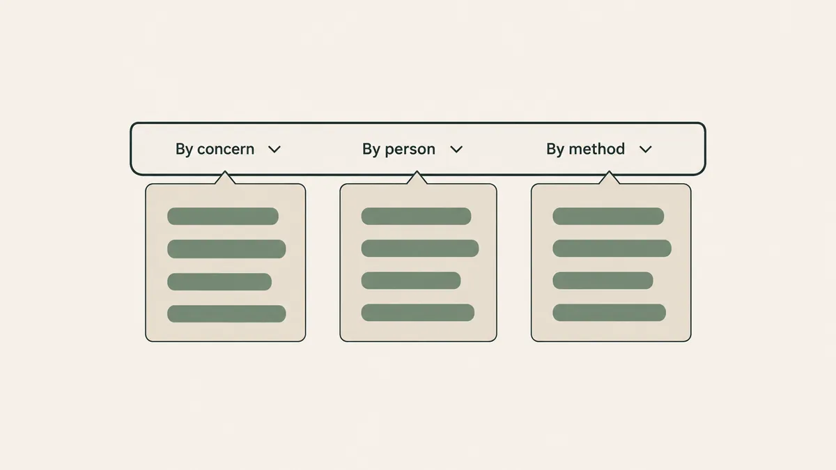
Brave Soul Therapy is an online group practice for adults and teens across California. Its menu sorts the same clinical work into three lists:
- Services, sorted by concern. Nine pages, including Anxiety Therapy, Trauma & PTSD Therapy, and Pet Loss Therapy.
- Who We Help is sorted by person: First Responders, Teens (14+), Neurodivergent Individuals, and four more.
- Types of Therapy, by method, with two pages so far.
Three lists, because people don’t search the way clinicians categorize. One person types “anxiety therapist.” Another types “therapist for first responders.” Someone else already knows the method they want. Each of them finds a page with their own words in the title.
And each page works alone. The anxiety page has its own headline (“Online Anxiety Therapy in California”), its own list of the clinicians who take that work, its own insurance section, and its own FAQ.
Copy this: you don’t need eighteen pages. Start with one page for your main concern and one for the group you most want to reach. Two honest specialty pages do more for a solo clinician than a single “Services” page with fourteen bullet points.
3. Coral Heart Counseling: fees posted where people look
Coral Heart Counseling is a group practice in Chicago. “Insurance/Fees” sits in its main menu under About, and again in the footer.
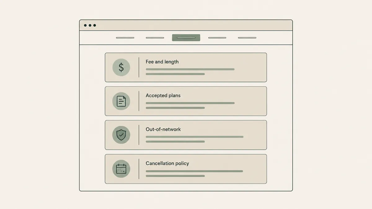
The page itself is short. A fee range for a 55-minute individual session. The four PPO plans the practice accepts. A note that an invoice for out-of-network reimbursement is available on request. Then the card-on-file rule and the 24-hour cancellation policy, with the late fee printed as a dollar amount.
Plenty of therapists leave fees off the site, worried the number will scare people away. We’d do the opposite.
Say someone with an Aetna PPO opens your site on a lunch break with twelve minutes to spare. If the site can’t tell them whether you take their plan, the easy move is back to the search results, where another practice will.
Copy this: one page, linked from the menu, with your session fee or range, session length, the plans you take, what you do for out-of-network clients, and your cancellation policy. We cover the full layout in our guide to a therapy fees and insurance page.
Brave Soul goes a step further on its own fees page. It lists ten questions a client can ask their insurer about in-network and out-of-network benefits, which is a generous thing to hand someone who has never used mental health coverage.
4. Dr. Guitelman Psychological Services: a bio that answers “can you see me?” first
Dr. Guitelman Psychological Services is a solo psychologist’s site with a four-item menu: Home, About, Services, Contact.
The bio block sits second on the homepage, directly under the headline. Its first credential line covers licensure: Florida, Texas, Washington, and 37 other PSYPACT states. Education comes next. Teaching and research come last.
That order is the decision. For a clinician who works across state lines, “are you licensed where I live” is the question that ends the visit if it goes unanswered. Say you’re reading from Texas and the bio opens with three paragraphs on therapeutic philosophy. You’d have to hunt for the one fact that decides everything.
On the About page the logic holds. An “Education & Licensure” list comes before the approach section, and the approach section switches to first person and names the methods used.
There’s a smaller detail to borrow too. The contact page promises a reply within 48 hours on business days. A stated reply window is a kindness to someone who just worked up the nerve to write.
Copy this: open your bio with the facts a client needs to qualify themselves (your license and the states you serve), then tell your story. Our therapist bio examples show the full structure.
What these sites have in common
Put the four therapist website examples side by side and five patterns show up.
- They say where they can see you. All four do it. “Throughout Michigan.” “Across California.” “In Chicago.” A list of licensed states.
- Booking goes to one place. Steady Mind’s four button labels share one destination. Brave Soul repeats a single “Get Started” button down the homepage and puts a call-or-text number next to the first one. Coral Heart’s “Book Now” opens the practice’s client portal. On Dr. Guitelman’s site, the free-consultation button goes to a contact page with a form and a phone number.
- Clinicians are named, with credentials. Coral Heart lists all five therapists by name in the menu. Brave Soul’s team page shows each associate’s registration number and supervisor.
- Money gets answered before the first call. Three of four. Steady Mind handles insurance in its homepage FAQ, and Brave Soul and Coral Heart give it a menu link.
- Each service gets a page. Three of four again. Dr. Guitelman’s seven services share one page, a reasonable call for a solo practice with a four-item menu.
Notice what’s missing from that list. Nothing about color or fonts.
Most lists of the best therapy websites judge a screenshot. That’s the wrong test, because a prospective client doesn’t experience your site as a screenshot. They experience it as a series of small questions, and the site either answers the next one or it doesn’t.
What should a therapist website include?
A therapist website should include a headline that says who you help and where, a page for each main specialty, a bio that leads with your license, your fees and insurance, and one clear way to book. Add an FAQ, a privacy notice, and contact details on every page.
That list is shorter than most checklists because it leaves out the optional things, like a blog or a newsletter. Those can wait until the basics answer a stranger’s first five questions.
One item needs a caution. If your contact form invites people to describe what’s going on for them, send it through a form provider that signs a BAA on the plan you’re paying for. We compare the options in our review of HIPAA form builders. This is general information, not legal advice, so confirm the specifics with your own counsel or compliance resource.
What to copy, and what not to
Copy structure. Leave everything else.
Worth copying:
- The order of a homepage: headline, who it’s for, how to start, who you are, what it costs.
- Menu logic, like Brave Soul’s split between concerns and people.
- A fees page skeleton.
- Where the booking button goes, and how few places it goes.
- Opening a bio with license and location.
Not yours to copy:
- Wording. Another practice’s sentences belong to that practice, and they’d sound wrong in your voice anyway.
- Photos.
- Someone else’s specialty list. A page about work you rarely do won’t read as true.
- Fee amounts. Set your own.
Say you love Steady Mind’s seven-word headline. Don’t take the seven words. Take the shape: a short promise, then the concerns you work with most. Yours might be about grief, or about couples who’ve stopped talking. Shapes transfer. Sentences don’t.
What a custom site costs next to a template
Here’s the trade-off we owe you. Having a studio build your site costs more than buying a template. Custom therapist websites typically run $3,000 to $15,000. Our own pricing is quote-based, so the way to a real number is to get a custom quote through the Website Inquiry Form, which starts with a free consultation.
If that range isn’t in the budget this year, a template is the honest alternative. Our therapist website templates are delivered within 2 business days, and none of the four decisions on this page needs a custom build. You can rewrite a headline on a template tonight.
What custom pays for is the deciding: someone working out your menu and your booking path with you, then building it. Website in a Week gets a custom site live in 7 days. Larger custom builds take about 3 to 6 weeks.
Questions therapists ask about therapy website examples
Can I copy another therapist’s website?
Structure, yes. Wording and photos, no. The order of a homepage, the labels in a menu, and the sections of a fees page are fair to borrow. Sentences and images belong to the practice that made them. That’s the fair way to use therapist website examples: take the skeleton and write your own words.
Should I list my fees on my website?
We think so. Three of the four sites featured here answer the money question before a client has to call. A fee range, your session length, and the plans you take are enough for someone to decide whether to reach out.
Which platform are these counseling website examples built on?
Steady Mind, Brave Soul Therapy, and Coral Heart Counseling run on Squarespace. Dr. Guitelman’s site runs on WordPress. None of the decisions above depends on the platform. If you’re still choosing one, read our website builder comparison.
How many pages does a private practice website need?
Start with home, about, a page for each main specialty, fees and insurance, and contact. For a solo clinician that’s usually five to eight pages. Add more only when you have a specific group or concern you want to be found for.
What do the best therapist websites have in common?
They say who the practice helps and where in the first screen, send every booking button to one place, name each clinician with credentials, and answer fees or insurance before the first call. Looks matter less than most galleries suggest.
The useful part of any list of therapist website examples is the decision underneath each site, and that part is free to take. Pick one from this page (the first sentence is the fastest) and change it on your own site before you redesign anything. If you’d rather have a studio make those calls with you, that’s the work we do in website design for therapists.