
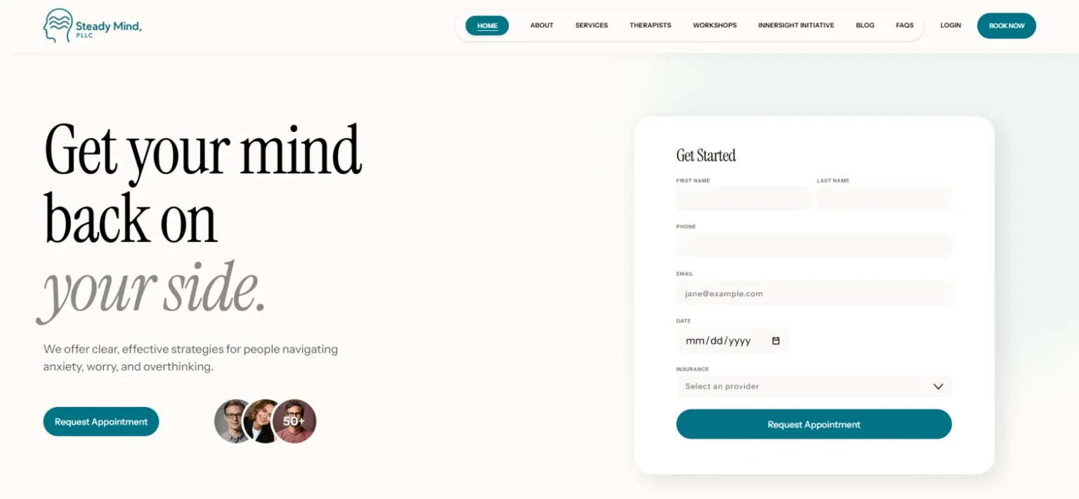
Steady Mind is a therapy practice built around a simple idea: that good clinical work deserves to be explained well. Alongside individual therapy, couples counseling, and psychological assessments, the practice publishes genuinely substantial writing—pieces on prolonged grief, exposure work for OCD, detached mindfulness, and even the history of the therapy couch. Not marketing fluff; actual clinical thinking.
That was both the opportunity and the problem. The practice had depth that a visitor couldn’t see in the first ten seconds, and in therapy, the first ten seconds are where the decision to reach out is made or lost.
What a therapy website has to do differently
Someone landing on a therapist’s website is often anxious, ambivalent, and comparing tabs. Our design rules for this audience are the ones we apply to every practice we build for: calm over clever—a restrained palette, generous whitespace, and no stock-photo handshakes; credibility above the fold—who you are, what you treat, and how to start, visible without scrolling; and one next step per page, because a nervous visitor given six options takes none.
For Steady Mind, that meant leading with the clinicians and the practice’s voice, keeping navigation to a handful of honest labels, and making “reach out” feel like a small step rather than a commitment.
Service architecture: one page per service, one job per page
The structural decision that matters most on a practice site is refusing to pile every offering onto one “Services” page. Each service gets its own page, their couples counseling page — is a good example written for the person searching for exactly that help. This does two jobs at once: visitors referred for a specific concern land on a page about that concern, and search engines get a distinct, focused page that can rank for that service on its own merits instead of competing with everything else the practice does.
Assessments got the same treatment as a first-class section rather than a bullet point. It’s a distinct service with a distinct audience, and burying it under “other offerings” would have hidden a real differentiator.
The blog as an asset, not an obligation
Most practice blogs exist because someone said they should. Steady Mind’s is different—the writing already existed and was already good. Our job was structure: clean URLs, a layout that makes long-form clinical writing readable, and internal paths from articles to the relevant service pages, so a reader who arrives for a piece on exposure therapy can find their way to the person who practices it. Over time, that turns the blog into the practice’s steadiest source of new visitors.
Results
The new website gives every service its own dedicated space, improves the reading experience for long-form clinical content, and creates clear paths from educational articles to relevant therapy services.
The takeaway for your practice
A therapy website succeeds on trust and clarity, not volume. If your practice has depth that your current site hides—services lumped together, writing nobody can find, or a design that doesn’t feel like you—that’s the exact problem we build for. See more of our work, or get in touch about your practice site.