Create Mobile-Friendly Therapy Experiences with Expert UX
Essential Mobile-First Therapy Website Design: How to Optimize Your Practice’s Online Presence for Clients
In an increasingly digital world, mobile-first design has become essential for therapy websites. This approach prioritizes the mobile user experience, ensuring that clients can easily access information and services on their smartphones and tablets. In this article, we will explore the critical aspects of mobile-first design, its impact on user engagement, and how it can enhance your practice’s online presence. Many therapists struggle with outdated websites that do not cater to mobile users, leading to lost opportunities for client engagement. By adopting mobile-first design principles, you can create a website that not only attracts clients but also fosters a supportive environment for their healing journey. We will cover the importance of mobile-first design, core principles, user experience optimization, HIPAA compliance, performance strategies, and practical implementation steps.
Why Is Mobile-First Design Critical for Therapy Websites?
Mobile-first design is crucial for therapy websites because it directly addresses the needs of clients who increasingly rely on mobile devices for information and services. With over half of all global web traffic coming from mobile devices, therapists must ensure their websites are optimized for this platform. A mobile-first approach enhances client accessibility and engagement, allowing potential clients to find and connect with therapists easily. Additionally, mobile-first design positively impacts search engine optimization (SEO), as search engines prioritize mobile-friendly sites in their rankings.
How Mobile-First Design Enhances Client Accessibility and Engagement
Mobile-first design significantly improves client accessibility by ensuring that websites are responsive and easy to navigate on smaller screens. Features such as larger buttons, simplified navigation menus, and clear calls-to-action enhance user experience. Research shows that websites designed with mobile users in mind see higher engagement rates, as clients can quickly find the information they need without frustration. For instance, a therapist’s website that allows easy appointment scheduling via mobile can lead to increased client bookings.
What Impact Does Mobile-First Design Have on Therapy Website SEO?
The impact of mobile-first design on SEO is profound. Search engines like Google use mobile-first indexing, meaning they primarily consider the mobile version of a website for ranking purposes. This shift emphasizes the importance of having a mobile-friendly site. Websites that are not optimized for mobile may experience lower search rankings, making it harder for potential clients to find them. By implementing mobile-first design, therapists can improve their visibility in search results, ultimately attracting more clients to their practice.
What Are the Core Principles of Mobile-First and Responsive Design for Therapists?
Understanding the core principles of mobile-first and responsive design is essential for therapists looking to create effective websites. These principles include fluid grids, flexible images, and media queries, which work together to ensure a seamless user experience across devices.
How Do Fluid Grids and Flexible Images Improve Mobile Usability?
Fluid grids and flexible images are foundational elements of responsive design. Fluid grids use relative units like percentages instead of fixed units like pixels, allowing layouts to adapt to different screen sizes. Flexible images automatically resize within their containing elements, ensuring they display correctly on all devices. This adaptability enhances mobile usability, making it easier for clients to view content without excessive scrolling or zooming.
What Role Do Media Queries Play in Responsive Therapy Websites?
Media queries are a critical component of responsive design, allowing websites to apply different styles based on the device’s characteristics, such as screen size and resolution. By using media queries, therapists can tailor their website’s appearance and functionality to provide an optimal experience for mobile users. For example, a media query can adjust font sizes and layout structures to ensure readability on smaller screens, enhancing overall user experience.
How Can Therapists Optimize User Experience on Mobile Devices?
Optimizing user experience on mobile devices involves implementing best practices for navigation, touch-friendly interfaces, and mobile-optimized forms. These strategies ensure that clients can easily interact with the website, leading to higher engagement and satisfaction.
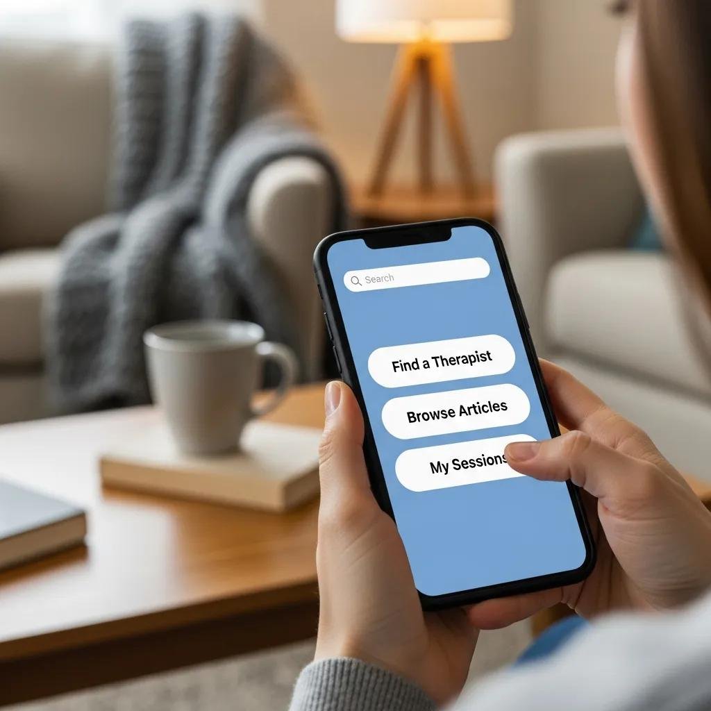
What Are Best Practices for Mobile Navigation and Touch-Friendly Interfaces?
Effective mobile navigation is crucial for user experience. Best practices include using a simple, intuitive menu structure and ensuring that touch targets, such as buttons and links, are large enough for easy tapping. User testing has shown that clients prefer websites with straightforward navigation, which allows them to find information quickly. Additionally, incorporating a search function can further enhance usability, enabling clients to locate specific services or resources effortlessly.
How to Design Mobile-Optimized Forms and Calls-to-Action for Therapy Sites?
Designing mobile-optimized forms and calls-to-action is essential for converting visitors into clients. Forms should be concise, with only essential fields to minimize user effort. Placing calls-to-action prominently on the page encourages users to take the next step, whether scheduling an appointment or signing up for a newsletter. Examples of effective forms include single-field inputs for phone numbers or email addresses, which streamline the process and improve completion rates.
How Does HIPAA Compliance Influence Mobile-First Therapy Website Design?
HIPAA compliance is a critical consideration for therapy websites, particularly when handling sensitive client information. Mobile-first design must incorporate security measures to protect client data while ensuring a user-friendly experience.
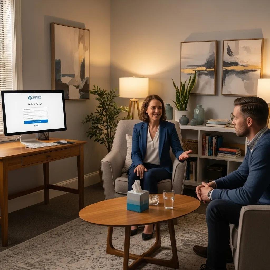
What Are Secure Mobile Client Portals and Data Privacy Measures?

Secure mobile client portals are essential for maintaining HIPAA compliance. These portals allow clients to access their information safely and securely from their mobile devices. Implementing encryption, secure login protocols, and regular security audits are vital measures to protect client data. Additionally, therapists should educate clients on the importance of using secure connections when accessing their portals, further enhancing data privacy.
How to Ensure HIPAA Compliance in Mobile Forms and Communications?
To ensure HIPAA compliance in mobile forms and communications, therapists must design forms that securely collect and transmit client information. This includes using secure, encrypted connections for data transmission and ensuring that forms do not store sensitive information without proper security measures. Regular training on HIPAA regulations for staff members involved in client communications is also essential to maintain compliance and protect client confidentiality.
What Strategies Improve Speed and Performance for Mobile Therapy Websites?
Improving speed and performance is crucial for mobile therapy websites, as slow-loading pages can lead to high bounce rates and lost clients. Implementing effective strategies can enhance website performance and user satisfaction.
How Does Image Compression and Lazy Loading Enhance Mobile Speed?
Image compression and lazy loading are effective techniques for improving mobile website speed. Compressing images reduces their file size without sacrificing quality, leading to faster load times. Lazy loading ensures that images are only loaded when they enter the viewport, further enhancing performance. These strategies can significantly reduce page load times, providing a smoother experience for mobile users.
What Are Effective Techniques for Code Minification and Caching?
Code minification and caching are essential for optimizing website performance. Minifying code involves removing unnecessary characters and spaces, reducing file sizes and improving load times. Caching stores frequently accessed data, allowing for quicker retrieval and reducing server load. Implementing these techniques can lead to faster, more efficient mobile websites, ultimately enhancing user experience.
How Can Therapists Implement Mobile-First Design Successfully?
Implementing mobile-first design requires a strategic approach that includes planning, execution, and ongoing evaluation. Therapists can follow a step-by-step process to create effective mobile-optimized websites.
What Are the Step-by-Step Actions to Create a Mobile-First Therapy Website?
- Research and Planning: Understand your target audience’s needs and preferences.
- Design Prototyping: Create wireframes and prototypes focusing on mobile usability.
- Development: Build the website using responsive design techniques and best practices.
- Testing: Conduct thorough testing on various devices to ensure functionality and usability.
- Launch and Monitor: Launch the website and monitor performance, making adjustments as needed.
How to Choose the Right Web Design Partner for Mobile Optimization?
Choosing the right web design partner is crucial for successful mobile optimization. Therapists should consider the following criteria when selecting a partner:
- Experience with Mobile-First Design: Look for a partner with a proven track record in mobile optimization.
- Portfolio Review: Evaluate previous work to assess design quality and functionality.
- Client Testimonials: Seek feedback from past clients to gauge satisfaction and results.
By carefully selecting a web design partner, therapists can ensure their website effectively supports their practice and enhances client engagement.