
CLIENT CASE STUDY
Restored Resonance
A quieter visual direction for an established wellness website.
- Client
- Kat Kirk
- Focus
- Health & wellness
THE WEBSITE DESIGN
The brief
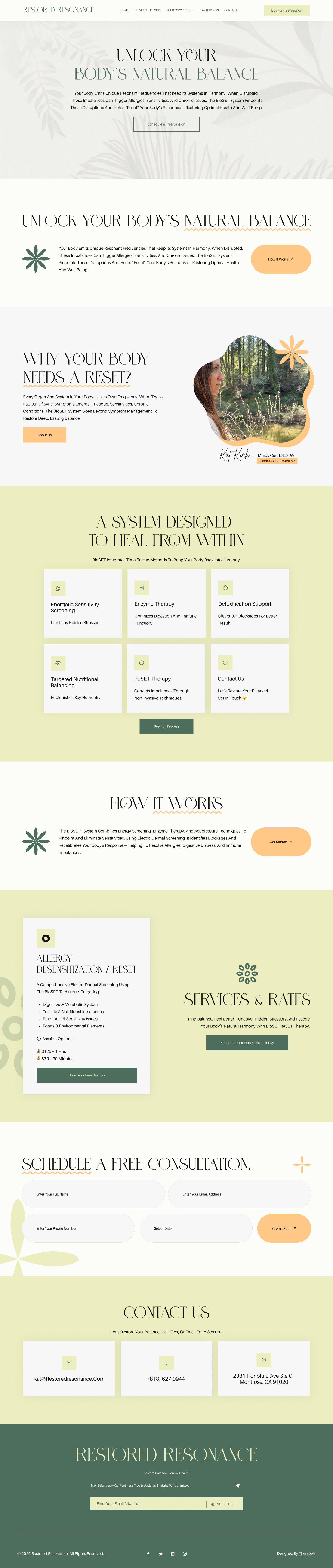
Kat Kirk wanted to redesign Restored Resonance around a calm, professional presentation of her biofeedback services. The brief emphasized earth tones, simplicity and avoiding an overly busy design.
Our approach
We worked with the existing logo and used a restrained layout with clear information groupings. The visual direction drew on the client’s preference for natural colors and an uncluttered reading experience.
What we delivered
- An earth-toned visual refresh around the existing identity.
- A simplified, intuitive page layout.
- Contact forms giving prospective clients a direct inquiry route.
Project record: View the original portfolio entry on Fiverr.
YOUR PRACTICE, YOUR PRIORITIES
Let’s make your website
work for you.
Tell us what needs to change. We’ll help you choose a clear next step.